-

-

Sunday, December 3, 2017

Design III, Phase 3: Jidapa Srimachand

Design 3, Phase 3
Fraternal Twins

Digital Age Library


This building is designed based on the DNA of Seattle Central Library.

This new library is the extension branch of the existing library, designed to fulfill the need of the digital age which was beyond prediction at the time the SPL was designed. 

In the case study, the architects used the concept of "compartmentalized flexibility" which is about separating the programs, the predictable and unpredictable from each other (physically), putting them in the the box so no programs can override the others and stay flexible within its own area.

This new Library is  a paperless library, based on the concept that, in the digital age, the information is online and can be accessible from everywhere. The new role of the library is to provide preferable conditions that helps people get the most out of it.

People will use their own digital devices to get their work done. The library also provides (manipulate) the power outlets to them.

original file here

The chosen location of  this new branch is on the pier, in the Elliott Bay, based on the belief that the more people are pulled away from the real world , the more they should be pulled close to nature. The site is 8 minute walk from the Central Library.

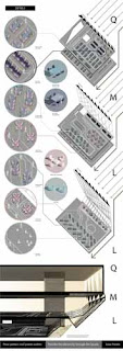
The form finding process is based on the massing of the case study building and the reinterpretation from the toy combined.

Starting with the program arrangement.
The programs are separated into 2 types, the more predictable and the less predictable, on how the people would use the space. The 2 types are put in 2 separated towers.  
The more predictable one has the learning center and the meeting rooms. The less predictable has the shared space separated into 3 floors with different atmosphere, loud, moderate, and quiet.

To get people closer to nature, the shared space tower is placed closer to the bay, and pushed back to in gradient to catch the ambient light from the north.
While the other of which people should focus more on people in their room is put on the city side. Each box is rotated more to the road on the ground level, and more to the other parts of the library when it get higher.

The push back and the rotation are also the strategy to create atriums.

The Central library have the unpredictable programs on top of the predictable box and the gaps create the atriums, However for this building, the 2 things are put in the separate building already, so to make use of the atriums the strategy of the active and inactive sides of the toy is implemented to utilize them.
The boxes have only 3 (out of  6) active side and the other are left to be taken care of by the wrapping of the facade.

original file here


original file here

The space between the two towers work as the circulation core, the place where can see where is everything and how to get there clearly. 
This way it navigates people the where they want to go in a no "boring" way, also direct and fast.

original file here

The floor plan above shows what's where on each floor. Each floor has different types, amount, and arrangement of the furniture 

original file here

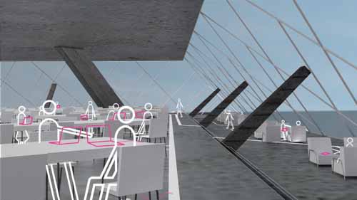
In the detail, it's about accommodating the users and bringing the nature in. 
In the existing library, the nature they brought in is the plants and their patterns are used to help people feel at ease. So in this digital age library, the nature that was brought in is the sun. It was taken in in a more digital way by the solar panels on the south facade, transfer though the facade structure, then the line continue into the interior as a light  up lines on the floor which has the power outlets on them. People can charge their personal device with the electricity from that.

view from the exterior corridor that shows all the lines brought the sun into the building.


The lines on each floor and around different furniture are arranged differently to give different effect on where people can sit and the sense of boundary.

original file here


On the quiet floor, the furniture are place in a more controlled orientation to give the sense of order. The power lines are placed between the tables so people must walk slowly when they through the space. The floor also has the highest ceiling, brightest light and clearest view out.

original file here

The loud floor has a more chaotic arrangement. The power outlets are everywhere so people can arrange the table by themselves. They be noisy  and messy as they want.
It also have the real relaxing bean bag zone which provides no power outlet at all. 

The moderate floor is some what between the to others. the power lines are placed under the tables so people can walk to see others easily. 


Friday, September 29, 2017

PLAY GIFTS & MANIPULATIVES : Pam Jidapa Srimachand

Design 3
Project 1, Phase 2
PLAY GIFTS & MANIPULATIVES

"bloc"


The design of the toy in this phase is decoded from the building in the former phase, which my assigned building is Seattle Central Library.
How the building was translated into a toy.
original image here.

The dominant properties of the building are the followings
  • The library is the "Library for all" that means it need to be able to serve everyone in the society.
    The library is not just the place for books and media, but also social gatherings.
  • The idea of compartmentalized flexibility. The programs of the building are put in to the boxes ( each floor). Each box is given a specific characteristic, they have the certainty of how they're going to be used while also having some space for the unpredictable similar uses that might derive.
  • The form of the building is based on 
    • the context of the city
    • how the boxes of programs (floors) are placed into their most suitable spots.
  • The continuity that leads users directly to where they're predicted to be the main attractions, not all the floors in the building.
  • The use of surfaces to clarify how to use the building.
    • The colours
    • The casual boundary

Basically, the toy is about placing/connecting the boxes with specific characters into their most suitable spot/alignment.


Parts 

original image here

Each box has different characteristics.
Original image here..


There're 4 colors, red, yellow, blue, and green, each one for each player.


Original image here.
Original Image here


Each color has 8 different boxes.
3 of the 6 sides are the joint side (in color)
the other 3 are plain and transparent.
(to clarify the use of the boxes and how to joint them)
4 of them has the color sides align in "C" shape
the other 4 has them share a single corner.


Original image here


There are 6 different types of (color) surface.

Original Image Here

Original Image here


Not all of them can connect together.
One type can connect to only 2 other types, not even itself.

The system translate the concept of compartmentalized flexibility.
How the surface joint is connected of the box can shift buy it won't leave the core of how it could connect.


How to play


Original Image here

The plain board
Also have the space inside to place the circuit and the battery.

At the beginning, the board is clear, nothing on top.

Original Image Here
Set up the tower in the middle to define the final point o the game.
The basic set up has the tower 2 boxes tall, but another box is provided in case the player wants the game to be more challenging.

Original Image Here
Start the game by placing a box on the starting point of their color.
(The magnet of the box needs to touch the magnet of the board so the circuit is not broken)
If playing with children, they can have 2 boxes connected at this stage as the advantage.


Original Image Here
The players take turns stacking their own boxes, blocking others and get to the final point to score.

Original Image Here
When a color reached the final point, the game ends, and the lights on the boxes will be on and emphasize the most direct continuity to the destination.
The person with the highest score is the winner, not necessary the player who make it to the top.

The rules of the game encourage interactions between players, not only care about getting to the final point just like what the library value.

Also, the game can be adapt to let everyone enjoy.

The color square on the board gives the sense of casual boundary, player feel comfortable on those with their own color.


 The rules


Original Image Here
For normal stacking, join the connectable sides together.


Original Image Here
Connect your box and block other colors with another connectable sides will earn you 150 points.

เพิ่มคำอธิบายภาพ
Be the one to place your box on the top of the tower and get 100 points.
The player need to make sure that he/she has the highest score then they can place the last box and win.

The mechanism

Original Image here
Original Image Here

In order to make to boxes light up when they reach the final spot on top of the tower, each box has its own lights and simple circuit inside.
The magnets on the surface are used as conductor and also help snapping the (right) boxes together.


Original Image Here

Original Image Here

Original Image Here

 Using the lights also reflect the technology advancement which is the characteristic of the city and the building.


Below are the pictures of the toy.

Original Image Here

Original Image Here

Original Image Here

Original Image Here
The basic set-up

Original Image Here
 While playing 

Original Image Here
 At the end of the game


Original Image Here

Original Image Here


Sunday, September 10, 2017

Design 3: Project 1.1: Pam Jidapa Srimachand

Design 3
Project 1.1


Seattle Central Library

Image from OMA.eu

General Information

This library is the central library of the other 26 libraries in the "Libraries for All" project that the people voted "YES" to in 1998.

The librarians want the library to be more than a place for books and information, but to be somewhere people can meet, create memories, and feel at ease.

Rem Koolhaas X OMA started working on this project from 1999 and finished in 2004.

Original image here

The analysis of the building is divided into 3 sections.
The whole, which I studied how the form was created,
the part, which is about the escalators and how they connect the programs
 and detail, which I looked into different type of surfaces used in the building.
Also compare the building with other libraries form the same and the other architects

How the form was created.

Original image here

The form of the library is a shifted boxes of programs.
The architect didn't want the building to be a boring box of books, so the mass was divided and shifted to the view of the nature that surrounds the city.
The results of the shifting and how the skin wrap around it make the building unconventional and give it big atriums.

How the building is connected together

Original Image Here

Original Image Here

Because the building is the "library for all", it contains many programs to accommodate the needs of all the people. Going from one floor to another by stairs or escalators can be a boring experience. So the architects designed some floor to be the most used by majority of people and give them continuity by linking them directly by escalators. This design helps users to get what they want in the shortest time.

Original Image Here
Different person has different needs, so the approach to the library is different.
OMA used the idea of personas. They divided people into 2 groups which are
  • The knowledge acquirer - people who want to dig deep and wide about what they're researching. (People who will look at many books, take them to the reading area, then borrow some of them)
  • Information Gatherer  - people who want quick and to the point information about what they're interested in. (People who knows what they want and go straight to get only that)
There're also other types of users
  • The space user - people who just want to use the space of the library to work on their own materials.
  • The space occupier - people who just want to use the basic facility of the public building such as heaters, chairs, and toilet. (Homeless people)


Original Image Here.

One of the highlight  of this building is the long one-way escalators that pierce through the book spiral. People can admire the view of  the books in the spiral while going up.
It produce the experience that cherish the books.


The Surfaces.

Original Image Here

The interior of the building uses many kinds of material to decorate the space, and create casual boundaries.
(on the first column in the drawing) They use the oversize picture of native plants that grows around the city to be the pattern of the carpets. The concept is to bring the beautiful nature of Seattle inside and that also makes the area look more elegant and playful at the same time.
Also (in the middle column) they have the floor in solid colors. The purpose is to define the area without building a wall.
(In the last column) they also have special material for the surface. The casual boundary from that type of surface is more permanent and gives stronger feeling.

To understand the building deeper, the building is compared to other libraries.

Original Image Here

The diagram above is the Qatar National Library by Rem Koolhaas of OMA, designed more that 10 years later than SPL.
It shows how the form of that building is created.
The architect fold the corners up so people can enter from the middle of the building.
At that point, they can see everything in the library. (The Paper folding method was also used when he disigned the Jussieu Library)
The building also has big atrium which is (almost) the whole building, have it this way also got rid of the navigation problem existing in the Seattle Central Library, and preserve the exiting feeling generate by the form.

Original Image Here

Comparing to the atrium of other libraries, many of them use the same language as the ancient Pantheon (Classical Architecture).
In the diagram above, there are Victoria State Library (1845) by Joseph Reed in Melbourne, Australia, and 
Stuttgart City Library (2011) by Yi Architects.
Both of them has the same components as the Pantheon, and that express the grandness and stability, opposite to the SPL that tries to make people feel at ease.

About the escalators


Original Image Here
Above is another library by Rem Koolhaas, The unbuilt award winning design of Bibliothèque nationale de France. The building (the book storage) is carved into voids with different shapes.
Each void contains programs(s) and they are linked together via escalators that pierce through the book storage as same as the one at SPL.

Original Image Here

The Birmingham Library (2013) by Mecanoo also has escalators as the climax of their experience.
Their library goes through the book rotunda, an act to cherish the books. But as same as the traditional layout of escalators in the Amsterdam Public Library (2007) by Jo Coenen & Co Architekten, The escalators connect every level and don't give articulation to any specific programs.

Original Image Here

In the Astana National Library (2009) by Bjarke Ingels Group (was in the team that designed SPL)
The Persian carpets used is also from the context of the city and they gives casual boundaries to the smaller relaxing spaces.
Also, in the Bibliothèque Alexis de Tocqueville (2017) by Chris van Dujin of OMA, the plant carpet was used along with solid color surface, and big carpet in the lobby area, as same as the SPL. They're believed to give the same effects and atmosphere as the carpets in SPL.

Original Image Here

In the 100 years older New York Public Library (1895), there are also a casual boundary defined.
The reading tables in the main reading room was framed by a white stripes. The stripes define the boundary as well as the SPL's, however, it gives the feeling of organizing more that relaxing.
They also have the surface of the ceilings decorated with classical paintings.

However, in one of the most high-tech library, the James B. Hunt Jr. Library (2013) in South Carolina, USA,
they have their surface covered with digital screens, they also have solid color surfaces to lighten the atmosphere